
PDF Theme Designer
The PDF Theme Designer turns a built-in export style into a reusable design system. Open it from the PDF Theme icon in the workspace navigation rail.
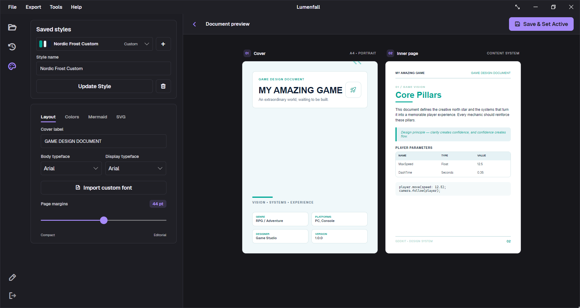
Understand the two save actions
The distinction matters:
- Save as Custom creates a reusable custom copy. When an editable custom style is selected, the same button is labeled Update Style and updates it.
- Save & Set Active saves the current values and makes that style the one used by subsequent PDF exports.
A saved style is not necessarily active. If export uses the wrong appearance, check the active selection in Workspace Settings or use Save & Set Active before exporting.
Start, duplicate, and delete styles
- Select one of the eight built-in styles to load its values as a starting point, or create an empty custom style.
- Enter a distinctive Style name.
- Adjust Layout, Colors, Mermaid, and SVG.
- Select
Save as Custom, orUpdate Stylefor an existing custom style, to keep reusable work in progress. - Select
Save & Set Activewhen it is ready for export.
Built-in styles cannot be deleted. Custom styles can. Deletion has no undo, so record important HEX and SVG values elsewhere or back up global settings.json.
Layout
| Setting | Purpose |
|---|---|
| Cover label | Uppercase descriptor such as GAME DESIGN DOCUMENT or VERTICAL SLICE BIBLE. |
| Body typeface | Paragraphs, tables, metadata, and most supporting text. |
| Display typeface | Cover title and document headings. |
| Page margins | A4 content margin from 24 to 64 pt, from compact to editorial. |
| Import custom font | Copies a .ttf or .otf font into GDDKit’s global font storage and registers it for export. |
Use generous margins for short pitch documents and more compact margins for dense internal specifications. Extremely narrow margins cannot fix a table that contains paragraphs; redesign the table instead.
Document colors
The Colors tab accepts HEX values for:
- accent;
- heading and text;
- secondary text and borders;
- cover background, cover panel, cover title, and cover subtext;
- metadata card background and text;
- quote background and text;
- code background and text;
- table-header background.
Use six-digit values such as #7C3AED. The editor does not provide a complete color-validation workflow, so malformed values can fail or fall back later. Keep text/background pairs at accessible contrast, then inspect a real PDF.
A safe contrast order
- Choose body and cover backgrounds.
- Choose readable text for each background.
- Add the accent.
- Derive borders and muted text.
- Test code, quotes, and tables separately.
Do not rely on the accent color as the only carrier of meaning.
Mermaid colors
The Mermaid tab controls exported-diagram styling independently from general document colors:
- background;
- node background;
- node text;
- connections;
- borders;
- cluster background.
The mini preview is useful for contrast, but the final diagram shape comes from actual Mermaid content. Export a flowchart with a cluster and a state diagram before approving a theme.
Custom fonts
Select Import custom font and choose a valid .ttf or .otf file. GDDKit copies the font into the local application-data GDDKit/Fonts folder, registers it, and adds its internal family to the typeface lists.
Important constraints:
- imported fonts are global to this installation;
- v2 has no font-removal interface;
- a font file can be rejected when its metadata cannot be read or registered;
- the theme will not reproduce on another computer unless that font is installed/imported there;
- you are responsible for font licensing and PDF distribution rights.
Use a dependable fallback style when sending the project to someone who does not share your settings folder.
Optional SVG layers
The SVG tab accepts markup for three separate layers:
- Cover: decorative or branded cover artwork;
- Header: a band rendered on content pages;
- Footer: a band rendered above or around footer content.
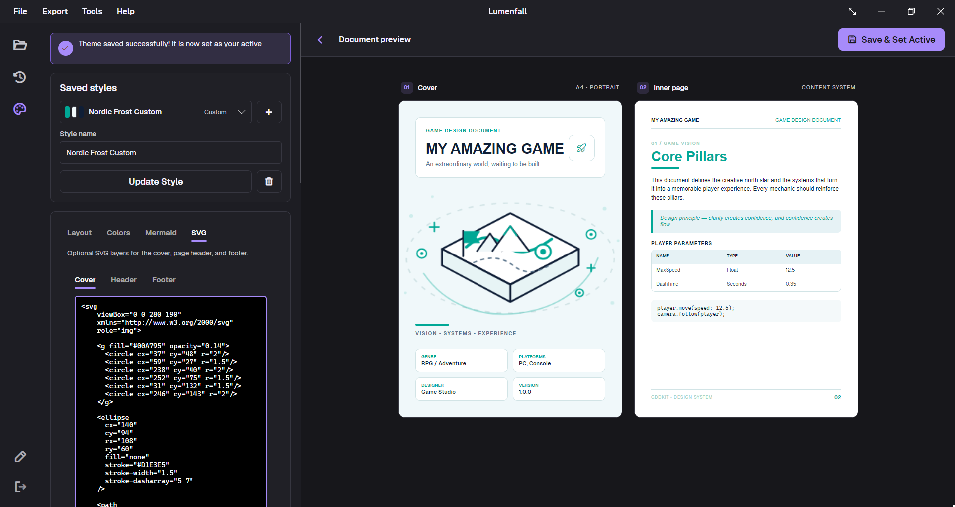
Start with self-contained SVG and a viewBox:
<svg xmlns="http://www.w3.org/2000/svg" viewBox="0 0 400 160"> <rect width="400" height="160" fill="#16111F" /> <circle cx="330" cy="32" r="72" fill="#7C3AED" opacity="0.35" /></svg>Keep SVG layers decorative. Avoid remote images, scripts, complex filters, and text that must remain editable. Use the regular cover-label and type controls for essential words.
The preview is a design mockup
The designer shows a fixed cover and inner-page specimen. It demonstrates typography, palette, cards, table, code, quote, and general placement, but it is not a live QuestPDF render of the current project.
Before delivery:
- save and set the style active;
- export a representative project to PDF;
- inspect the cover, TOC, longest heading, widest table, code, quote, image, Mermaid, and changelog;
- test on another PDF viewer if the document is external-facing.
The PDF rendering checklist in the v2 feature reference can help build a stress-test project.